OkCapsule
Brand & Website
OK Capsule empowers clients to deliver premium personalized vitamins & supplements directly to consumers, eliminating third-party involvement for optimum control and customer satisfaction. They produce customizable vitamin packs that can be tailored to a specific ailment or to an individual. They came to us to redesign their B2B website and streamline their brand positioning and sales strategy.
The Challenge
OK Capsule needed to build trust and credibility with their clients by effectively communicating their commitment to consistency, quality & transparency through their brand. They also needed to sell clients on the benefits of launching a personalized supplement line. We re-envisioned their website architecture from the ground up and updated their brand language to better reflect their offering.

Trustworthy Branding
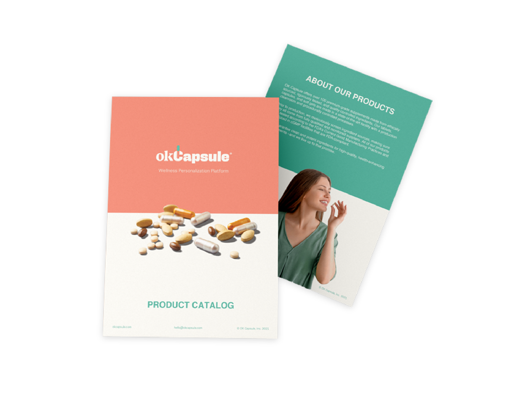
We designed a compelling logo that exudes trust, drawing inspiration from classic pharmaceutical brands while incorporating a modern touch. Furthermore, we developed a distinct and recognizable icon derived from the capital letter C. To highlight OK Capsule's origins in the supplement industry and set them apart in a competitive landscape, we employed a contrasting color palette featuring warm tones and a vibrant purple.
Primary Logo
icon
Color Palette
Typography
Headline
Body Text
Icon system

Brand Colaterals
Effective Website
Our goal was to create a website that seamlessly combines captivating visual design and intuitive functionality. The resulting website not only effectively communicates the Ok Capule’s offering, but also presents their innovative business model in a way that is easily understandable to their target audience and a wide range of users.


